7 STYLING MISTAKES YOU MIGHT BE MAKING IN YOUR HOME
The world of interior design can be a little overwhelming, but you don’t need to be a seasoned stylist to achieve a beautifully decorated home. Sometimes, it can seem like there are so many rules on what to do so instead of trying to absorb every rule of interior design and focusing on what you should do, consider starting with what you shouldn't do. From neglecting your home's lighting to an over-reliance on matching sets, avoid these 7 interior design mistakes and you’ll be able to create a space that's not only stylish but also truly feels like home.
1. Ignoring Scale
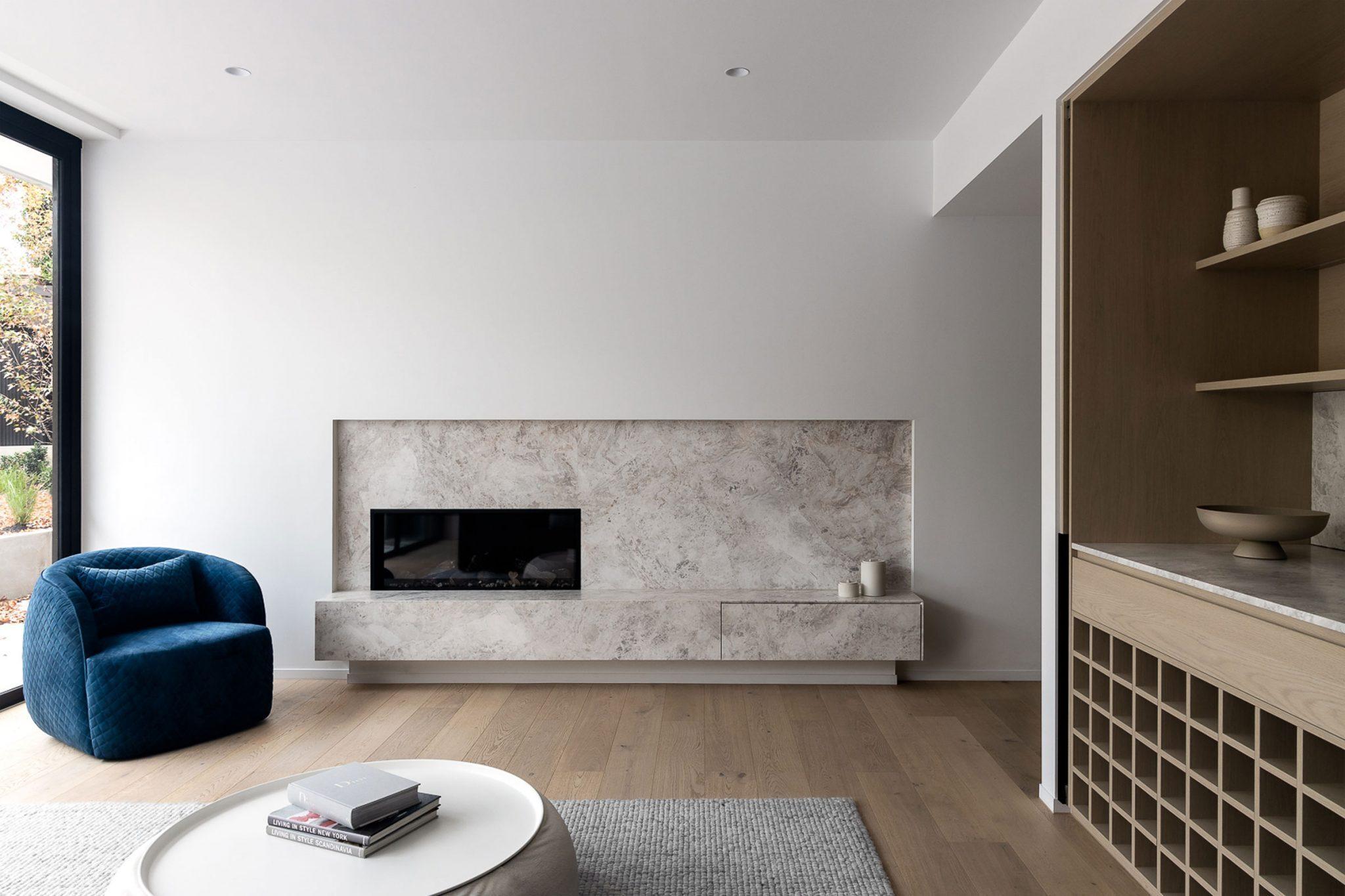
One mistake we see all too often is the incorrect scaling of furniture in a room. Think a large, expansive living room that’s improperly balanced with undersized furniture - it just doesn’t look right! In the same breath, the same rule applies for a smaller space with furniture that’s too big as this can overwhelm the space. It’s important to match furniture size to room dimensions for functionality and flow. Ceiling heigh should also influence your design choices. Pay attention to the height of your walls and use the space accordingly. Interior designers are often wary of rooms with tall ceilings that do not include anything to give it a human scale when you’re in the room, and they suggest using lighting, such as hanging pendants, to give a room a sense of scale.

2. Choosing The Incorrect Rug Size
Rug placement and size is crucial and can either make or break a room. People don't realise that smaller rugs in spaces creates a smaller, less pulled together look. Instead, try to cover the entire room with an area rug, leaving a border between 8-12 inches wide of the revealed floor. It creates a more cohesive, finished look, and makes everything feel so much larger. Furniture looks best when sitting on top of a more generous-sized rug. When you have a small rug sitting in front of, or only under part of your furniture layout, it tends to make the space feel smaller and disconnected.
3. Overdecorating
An excess of decorative items can clutter a space rather than complement it. Sure, knick-knacks and decorative items give a home personality but too much can often read as messy. Instead, opt for a thoughtful and balanced curation of the finishing touches as this is what sets a room apart. When in doubt, less is more and a minimalist approach to accessories can help to create a more refined aesthetic. Remember, every piece in your space should have a purpose or tell a story, ensuring your room feels personal and cohesive, not overcrowded and disconnected.

4. Improperly Hung Artwork
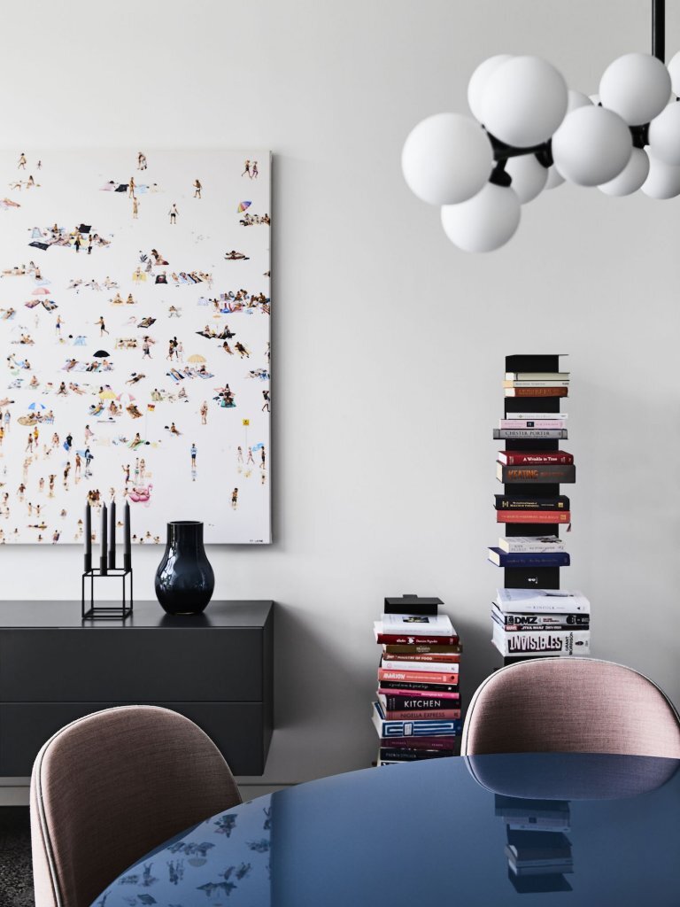
Another common mistake that designers see all too often? Art that’s not hung at the right height. While it may not seem like a big issue, this can actually influence the entire scale of a space, making or breaking a room! The viewing angle should be comfortable when you walk in the room as well as when you’re seated, so try to hang artwork at an eye-level that suits both standing and seated perspectives.
5. Uniform Furniture Height
If you want to make an interior designer go crazy, keep all your furniture the same height! Often considered a fundamental mistake in the design world, this approach can make a room feel flat and a little two-dimensional. A skilled interior designer knows the importance of varying heights within a space to create layers that guide the eye, add interest, and make the room more dynamic and inviting. This method not only enhances the aesthetic appeal of a room but also maximizes its functionality, allowing for the creation of distinct zones within the same space.

6. Too Much Matching
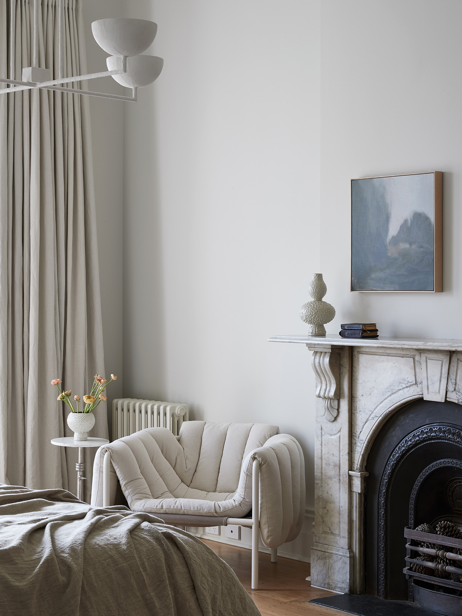
While we can probably all agree that a cohesive design scheme is essential, going overboard with matching furniture and decor can make a space feel flat and uninspired. This approach lacks personality and can make your home look more like a showroom than a reflection of your unique style. Mixing textures, materials, and even design styles can add interest and depth to your interiors. Don't be afraid to pair a modern sofa with a vintage coffee table or mix metals and woods for a layered, eclectic look.
7. Neglecting The Power Of Lighting
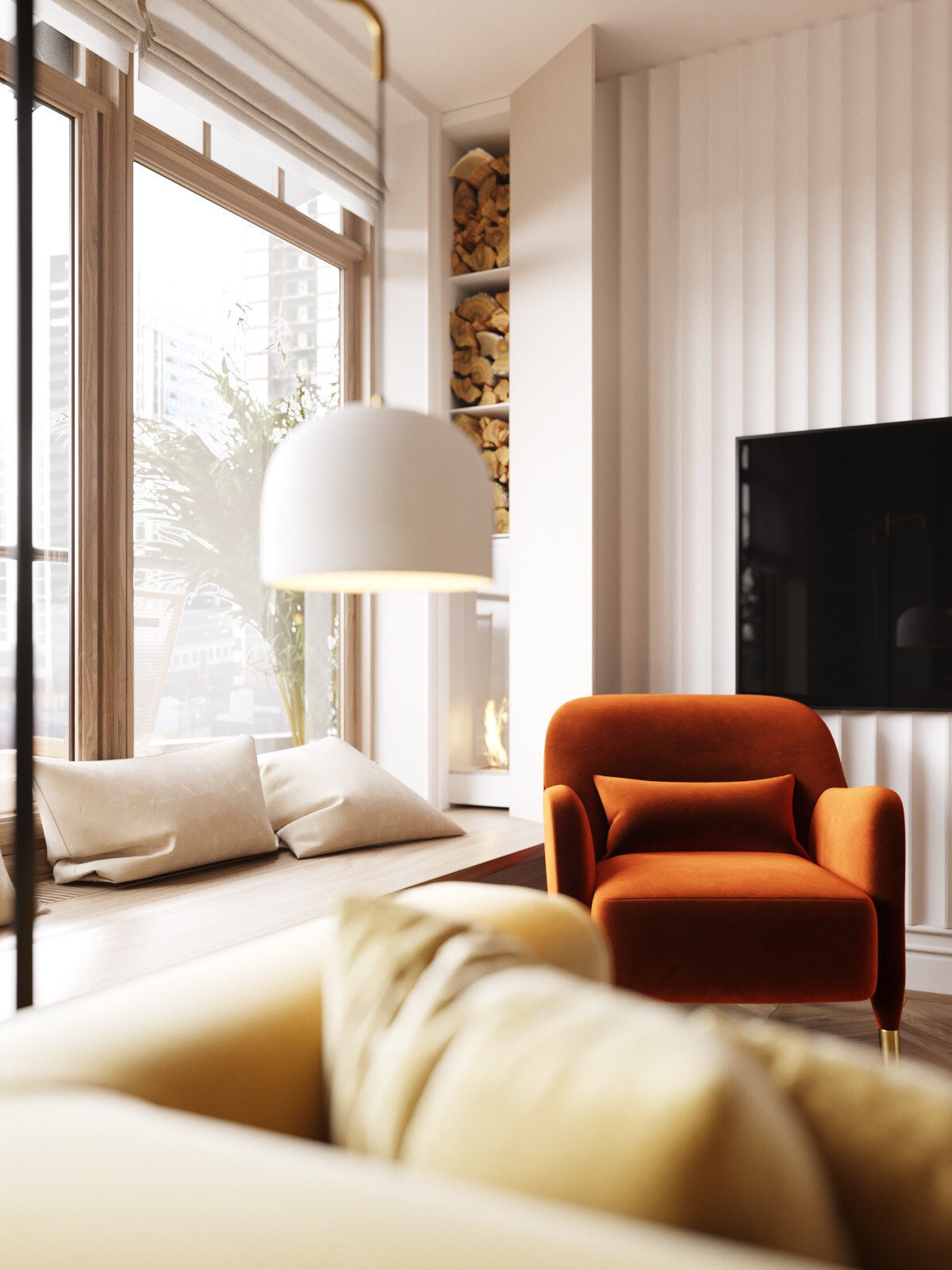
Don’t underestimate the power of lighting! Far too often, lighting is an afterthought, with many settling for whatever fixtures are on hand or just relying on harsh overhead lights. Lighting isn't just about making sure you can see; it's about setting the mood, highlighting your favourite pieces, and creating a warm, inviting atmosphere. By using a mixture of downlights, moveable downlights and ambient lighting you can turn any ordinary room into a masterpiece.